Tuesday 27 December 2011

Coldplay - Paradise


The cover art is an interesting one, as on a first look it looks like your average run of the mill abstract art but what makes it more appealing is the artists (whose name I can't find anywhere on the internet) use of subliminal messaging and its links with the Mylo Xyloto theme and the abstractness of the name of the album itself.

Overall the cover is quite a simple one, it is an abstract piece that enmeshes different shades of blue with randomly placed bold brush strokes of black, white, magenta, pink, yellow and green (Colors which were put to good use in the 'Every Teardrop is a Waterfall' video). In the bottom right corner the word art appears written in light blue color against a backdrop of whiteness. If one looks closely one can see a barely visible phrase written in a light graphite grey
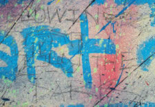
 The message reads Glowing in the Dark.


The name of the artist and the song is written in translucent soap bubble like fonts (similar to the albums cover), which apparently is the unicycle riding elephant's hand(paw?)writing as its seen on the placards he hold while busking in the video, with a similarly styled butterfly fluttering just above the text. Below the text a crayon art of another butterfly and an Archimedean spiral is portrayed, both are a recurring theme in not only this song and its video but in concerts, wardrobes and official webpage.


Official Webpage


On Guy Berryman's sleeve
 My initial opinion, when I started writing this review, of the cover was a negative one, based on the creative streak that the video carried I was thinking that the cover might have been much more than what it is, but as I got deeper into writing it and researching for it I realized that this cover makes an important piece of a jigsaw puzzle built around the theme used  by Coldplay to promote this album. In conclusion, the cover art is a brilliant one in my opinion although it might not be initially patronizing but, like a Van Gogh art piece, it grows on one as one studies it.

Sunday 25 December 2011

Little Mix - Cannonball

Little Mix made history on 11th December, by being the first group to win The X Factor in its eight years run. Their debut single, Cannonball is a cover of Irish singer, Damien Rice's song.

The cover is predominantly black & white with bits of it in colors. The group is present on the cover in walking posture. The band's name is on top in different colors. "The X Factor Winner" logo is present in a slight tilt, giving it an appearance of a seal (emblem). The title of the song is at the bottom, in black.


The girls are mostly in black and white, except some of their clothing and accessories are in colors. The band name "Little Mix" also has a pencil-sketch shadow. This is giving the cover a nice little touch, as if the girls are coming out of monochrome into the spotlight and yet-to-show their full colors (read "potential"). Which is true in their case, since they have only been covering others' songs and we have yet to hear their original stuff.

On the downside, there are couple of things I disliked about the cover. First, Jesy Nelson and Leigh-Anne Pinnock (girls on the right) are both sporting half-shaven hairstyle, which we have already seen on Cassie and Rihanna, and more recently on Willow Smith and Cher Lloyd (another X Factor participant). I am not personally against the hairstyle, although I do find it a little risky. But my main complain is, why two of them?
Secondly, Jesy's outfit is poor. It simply makes her look chubby. Skin-tight leggings for her is a bad idea.

Despite its small shortcomings, I like the cover for its classy appearance and light shades of colors (easy on the eyes). And the girls showing off lovely genuine smiles. Overall, a decent cover.

Thursday 22 December 2011

Lana Del Rey - Video Games

The cover is a simple front-facing photo of Lana standing behind an off-white background. Her name is written to the left of the photo in semi classical fonts. The names of the two tracks which make the EP are written in ordinary fonts.


What catches the attention immediately are her artificially pouty 'fake' lips, (which are creating quite a buzz in the indie music blogosphere), the floral head wreath and the cross necklace. All of this goes well with her soulful so called 'gangsta nancy sinatra'-esque voice and her enticing 1950's looks, which she has been wearing in her introductory makeover ever since she has donned the spotlight. One thing that deserves a mention here is the artist's fascination with  flowers. In her fledgling career, flowers have been a part of her outfit on many different promotional photographs, videos, concerts and promotional events.


To conclude it all, the cover bodes well as her portrait of flame haired, wide eyed, pucker lipped and floral encrusted dame, altogether, fits with her deep voice and her overall public persona of a post-war era cinematic beauty.

Saturday 18 June 2011

Example - Changed the Way You Kiss Me

Changed the Way You Kiss Me is latest electro dance release by Example. This is first single from his upcoming third album, Playing in the Shadows. The single peaked UK singles chart immediately upon it's release.


 The cover design is simple, so my review is going to be pretty short, since there is not much to say here.

The cover art is black and white, giving it a vantage appearance. The large and round 'e' adds to it by giving it an old vinyl record looks. The text is all small letters. The large and strong 'e', that has been trademark at most of Example's recent outings (drum kit, T-shirt print etc.), is present here with all it's glory. His name also appears in the same style as his previous albums and singles.

The cover art is very dark (Example has said that his upcoming album is going to be darker than previous albums). The plain and simple art clearly wants to avoid revealing anything about the album. Even the word 'example' appears same as seen earlier in last album and singles. Either Example wants to stick to it, or like most artists, he is waiting to transform when his album is ready to hit the market.

In my opinion, a tight-lipped art that clearly wants to avoid exposure. Unfortunately, in all it's composure, the cover art forgot the song it is supposed to represent.

Sunday 12 June 2011

Alexandra Stan - Mr. Saxobeat

Alexandra Stan is making music headlines across Europe with her latest single called Mr. Saxobeat. The Romanian beauty finally managed to make ripples in music charts as far as United Kingdom.


In the cover art, Alexandra has fortune-teller thing going on with bracelet beads and long earrings, which fits nicely with Alexandra's Romanian origin.

Pink and white abstract background makes a soft appearance. Yet black colors in the background art gives slightly sinister and sensual touch to it. I believe this is intentional since the music video of the song goes along the same lines with it's theme 'jail-breaking criminals disguised as foxy cops'. Her sitting stance with legs wide open is also unlike lady, which also hints of her dominatrix persona.

Though the overall cover art has slight soft cloud effect, which works well in saving her beauty and fragility from getting compromised in all the darkness in the cover. The shoulder fur goes further in adding to the softness.

The letter O in the word Saxobeat is made to appear like a speaker. Putting a speaker on cover art when the song title has word "beat" in it, is a nice touch. This is fine example of how simple an small things can make a big difference in a cover art. Her name appears on the cover in her signature style. The N in STAN is inverted and mirrors the N in ALEXANDRA. The cover artist deserves praise for it in my opinion. It really puts the, otherwise simple and dull text in perspective.

Overall, I am pleased with the cover for its many creative tidbits. Nicely done.

Wednesday 1 June 2011

Aloe Blacc - I Need a Dollar

Aloe Blacc's "I Need a Dollar" has been hitting the top of music charts recently. It was widely successful across Europe reaching top ten in many countries including the UK.

The music and lyrics are by Leon Michels, Nathaniel Hawkins, Nick Movshon and Jeff Dynamite.

Its the title track for the HBO show How to Make It in America, and was also featured as the iTunes Single of the Week.


The cover art of this song gives a very vibrant aura. Aloe Blacc is standing in a plush white suit with a big red bow tie. We can see trees and sunlight in the backdrop. Aloe's facial expression gives a calm and resolute look, he stands tall & gives a feel of a man of style and taste.The use of the colors white and red gives more of a festive feel, the green in the backdrop gives an outdoor persona to the whole cover artwork making aloe look like a man on a mission .

On a personal note, I would have preferred a low tone artwork to complement the title of the track. This cover gives an opposite impression to what the song is about, wearing a red bow tie and white suit gives more of 'I have plenty of dollars and there are more coming' feel than otherwise.

All in all, a different approach from his previous covers, the artist has succeeded in grabbing the audience's attention through the use of contrasting colors, but keeping in mind the title of the track, it has failed to live up to the expectations.

Sunday 29 May 2011

Pitbull Featuring Ne-Yo, Afrojack & Nayer - Give Me Everything

Pitbull's latest single from his album Planet Pit has been making buzz in the charts around the world. An electro dance number featuring Ne-Yo and Nayer, called Give Me Everything. The single is produced by Dutch DJ/Producer Afrojack.


The single cover is simple. It has a head shot of Pitbull in formal shirt, tie and shades. Pitbull maintains his image with formal clothing and shades, and dominance of blue color (in continuation of his album cover). The cover, including the text, is all in black and blue duotone.

The text is where it really lost it. The word PITBULL appears above the head shot, and the featured artists names appear below in smaller text size. The title of the track, spaced and centrally-aligned, is written below the Pitbull's image. The TRON-inspired text was probably designed to give it a "cool" feel, but fails to make an impression. 

The image of Pitbull deserves credit for delivering that flirty look that complements the song theme. The blue color tone and presence of a faint lens glare focused on Pitbull, adds to his appearance nicely. Mr. Pitbull's looks and smirk suggest he has hit the right button with the right girl.

The overall design of this cover is fine, but the simple cover does not make any effort to appeal to the audience, which is a bummer considering this is second-best chart appearance of Pitbull as lead artist (I Know You Want Me - Calle Ocho was the best when it peaked at 2nd place on Billboard Hot 100 in 2009). It will pass under your radar without making any bleep. All in all, an average cover art that should have done more to do justice to the international club hit.